Concept and comic work benefit from the same free human critique: composition energy first, then nuanced color temperature — without inventing a story we do not know.
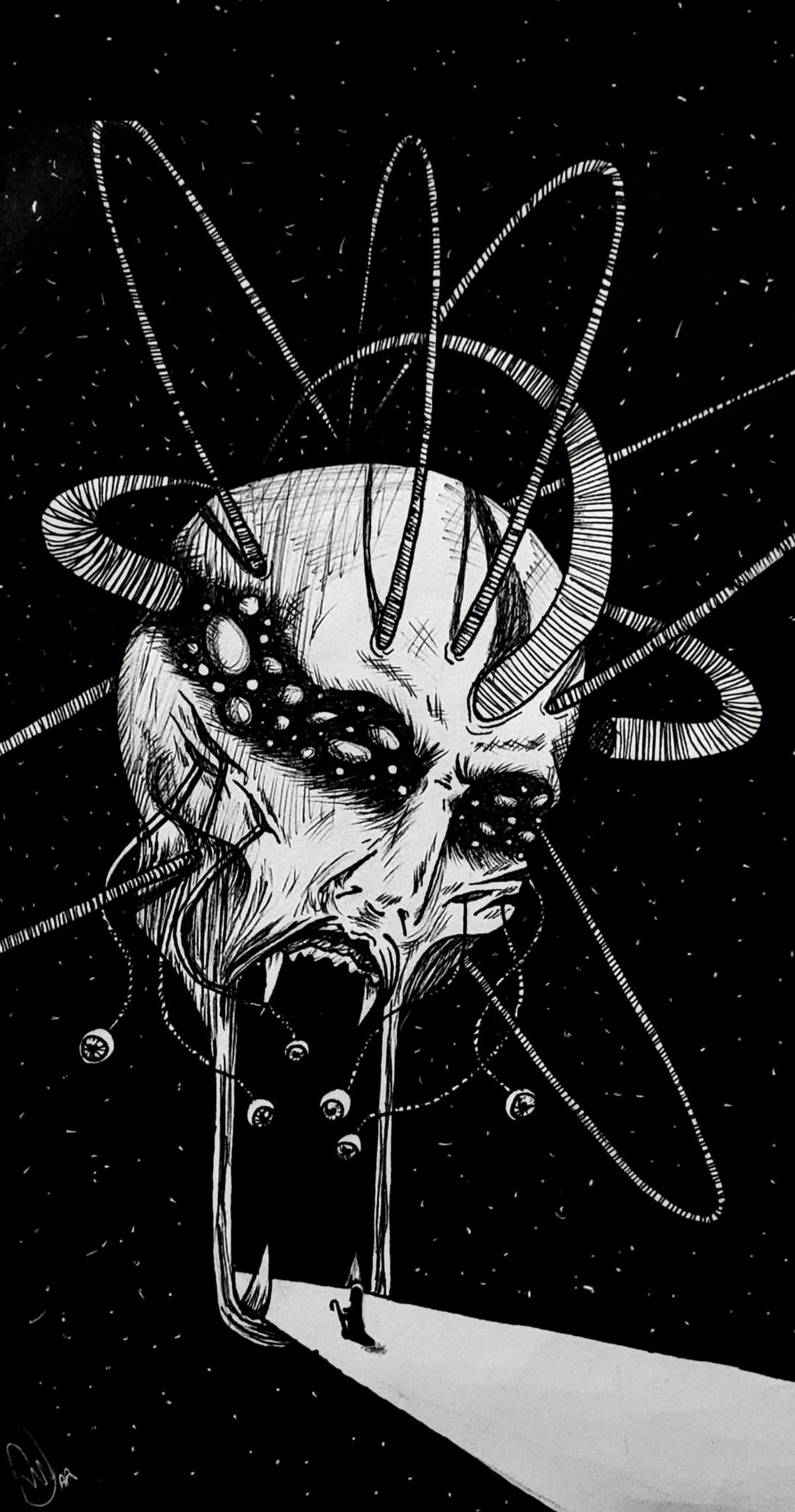
Artist: Komoria
Concept art for an old comic book idea — ink and paint on paper.
Teacher critique
The rhythm, color palette, and overall design are quite strong in this piece. The artist clearly understands how to create impact and energy through contrast, movement, and composition.
Since I'm not very familiar with the story or character being depicted, I can't really comment on the concept itself. My feedback is mainly focused on the visual aspects of the painting.
One area that could be developed further is color variation. While the dominant red works well and creates a powerful mood, the painting would become even richer if the colors shifted more subtly within the same color family. For example, some reds could lean cooler, while others could lean warmer. The same idea applies to the blacks, grays, and highlights throughout the image.
These small temperature shifts often add depth and complexity without changing the overall color scheme. They can make the lighting feel more convincing and give the image a greater sense of atmosphere.
Overall, the piece has a strong visual presence and a clear sense of movement. Exploring more color temperature variation would make it even more dynamic and interesting to look at.
Want private feedback like this, but deeper?
Submit your drawing or painting through our free art feedback form first. A real artist reviews your work and replies by email — usually within 48 hours. No AI scores.
If you want private, priority support with more detailed teacher notes, exercises, study resources, and progress tracking over one month, choose the Priority Critique Pack — $30 / 1 month.
More examples live in the public gallery on the Free Art Feedback page.