
What Are Values in Drawing and Painting?
Drawing guide · Lesson 1.1
What Are Values?

Importance of values
Color has three components: hue, saturation, and value. The value is how light or dark a color is — it describes differences in the intensity of light reflected from a color.
Values are what you see when you take the color out of a photograph, and range from white, through different shades of gray, to black.

Full color photograph
Black and white photograph
In the above photograph you can see all the colors.
In the above black and white photograph all you can see are different values.
Measuring values
To measure values, you can use two techniques:
- reference points in nature
- comparison, using a value finder
Also useful is a black mirror to help you see values more accurately.
Values are important for two reasons:
Realism
- Eighty percent of the realism in your painting comes from choosing the correct value.
- Of the remaining twenty percent, the majority is probably saturation, not hue.
- Therefore when choosing the correct “color,” think mainly about value and saturation.
- This is why painters like Matisse can use “wrong” colors when values are right.

Karl Schmidt-Rottluff
Also remember that the human eye can be fooled into thinking a certain color has a lighter or darker value than it actually has.
For example, people tend to think reds and oranges are light, when in fact they have middle values.
Design
- Not only do values contribute to realism, they play a major role in the abstract design of your painting.
- The arrangement of darks and lights is called notan.
Examples
How to use values
Values are used to structure a painting, establish a center of interest, and lead the viewer into and around the painting. Rembrandt and Caravaggio used strong contrast of values to focus the viewer’s eye on the main area of the painting.

Rembrandt
Values describe the forms of objects, and indicate the direction of light.

Melendez
They are also used to create the illusion of distance, or atmospheric perspective.

Bierstadt
In this painting, the figures are much darker than the background and so the contrast makes the eye focus on them.


Jean-François Millet
In the still life painting below, the values give form and shape to the vase and flowers.
In this landscape painting, the lighter values make the scene fade into the distance.
Types of value scale
You can have different numbers of values in a value scale. The scales with only a few values, such as three, four and five, are called limited value scales.
Note: For convenience this course uses one to refer to black and nine to refer to white, even though in the Munsell scale these numbers would refer to “almost black” and “almost white” respectively.
Three value scale
Four value scale
Five value scale
Nine value scale
STEP-BY-STEP: HOW TO CONVERT IMAGES FROM COLOR TO BLACK AND WHITE
To help you see values better, you can take a photograph of a scene and use a computer to convert the image from color to black and white. This will help you see the values in the scene much more clearly.
Adobe Photoshop
- Open the image in Photoshop.
- Select Image → Mode → Grayscale and click OK.
Other editors
Look for Grayscale or Desaturate under the Colors or Image menu (Affinity Photo, mobile apps, etc.).
Caution — photography vs the human eye: Shadows often appear very dark in photographs because the camera uses one aperture for both shadows and lights, whereas the human eye adjusts when looking at shadows. When painting from photos, compare shadow areas to mid-tones — you may need to lighten shadows.

Full color photograph

Black and white photograph
Free demo lesson
Want a trained artist to look at your values?
Submit your exercise for written feedback, explore courses, or continue the tutorial path.
Part of the Complete Drawing Guide. More chapters and lessons are listed on the main guide page.
YOUR HOMEWORK
Try it before your next class
Exercise 1 — Old masters in grayscale
Time required: 1 hour. 6 Paintings, 10 minutes each
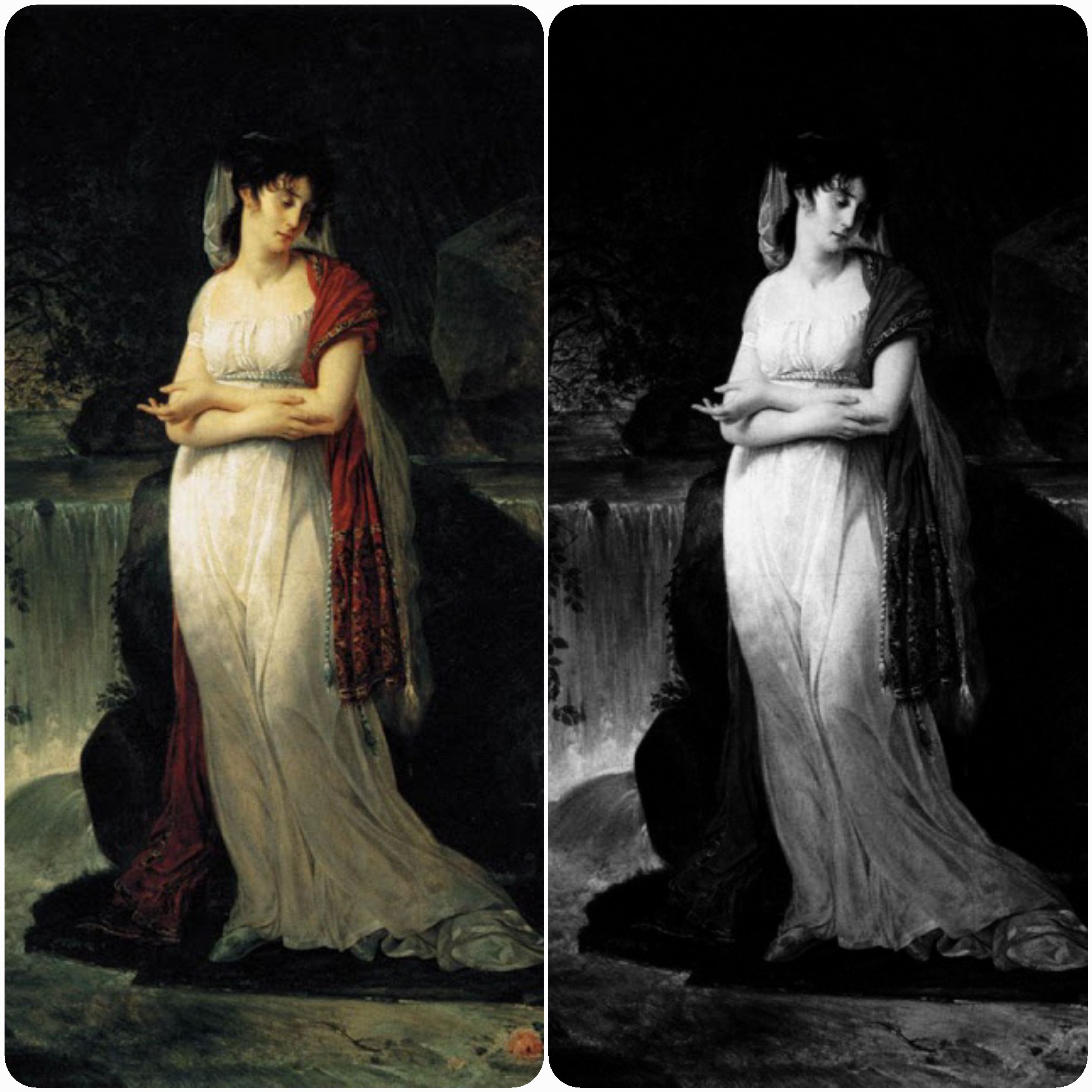
Choose six historical paintings and six contemporary works from museum websites. Convert each to black and white. Ask: are the values clearly separated? Pick one piece with unrealistic color — does it still read as a believable scene in grayscale? Note the artist, title, and date when you save references.

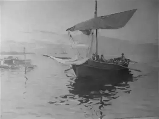
Exercise 2 — Your baseline painting
Time: 2–4h
Paint or draw a subject you enjoy — from life if you can, otherwise from your own photo. This is a baseline, not a masterpiece: something you can compare against later as your value skills grow. Photograph the work, convert a copy to grayscale, and ask whether the lights and darks describe the forms convincingly.

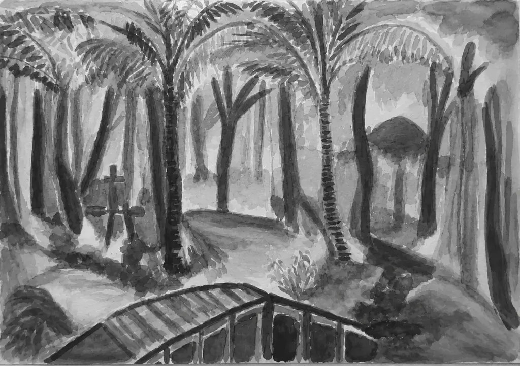
When you’re done: upload your photos below in Exercise submissions (log in if prompted).
Exercise submissions
Upload your exercise photos in a comment. Your tutor will reply on this thread.
5 responses to “What Are Values in Drawing and Painting?”
-
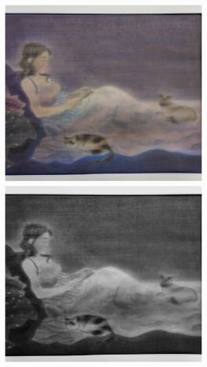
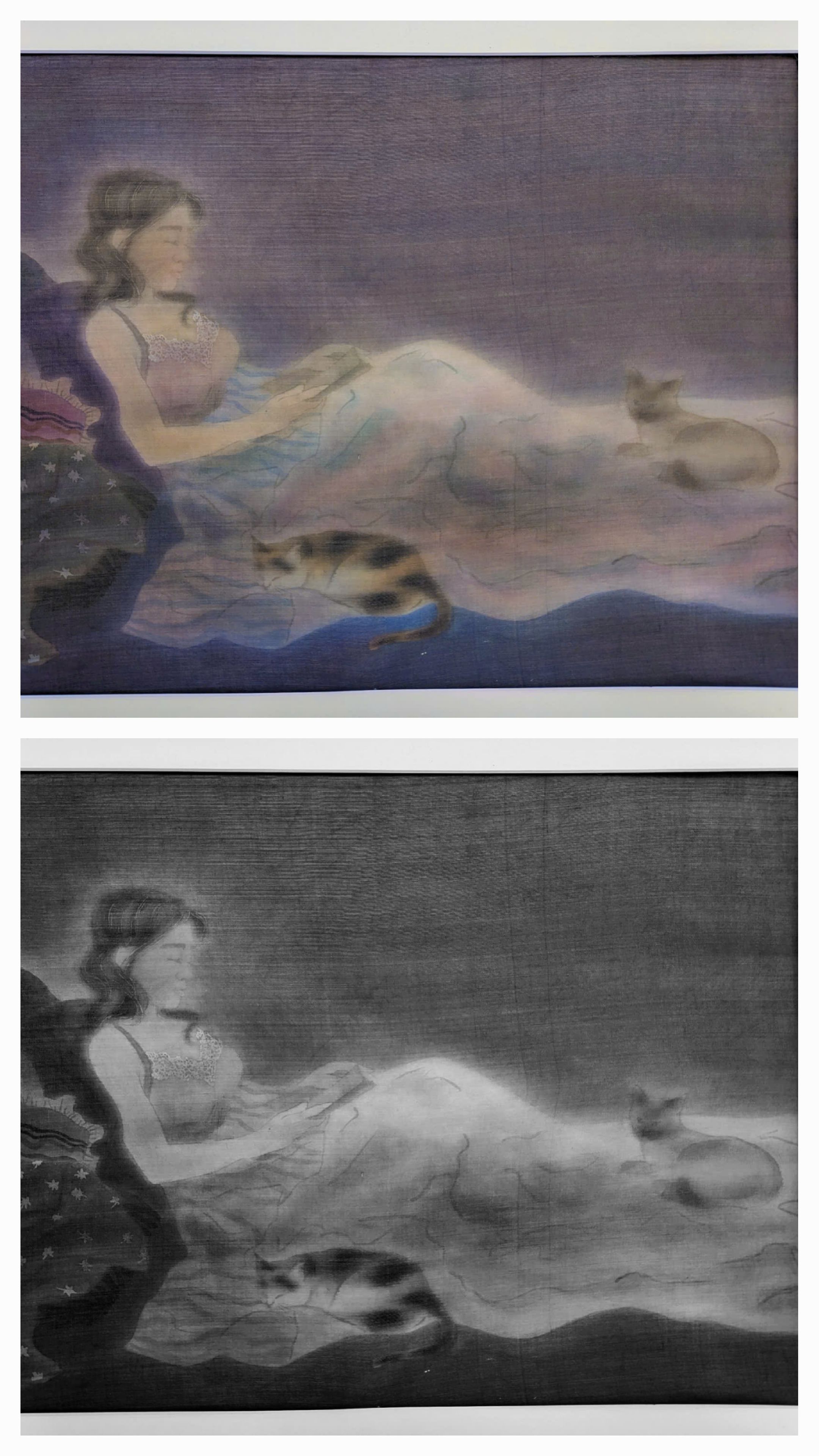
This’s one of my artworks paint on silk, I think it’s look still good in grayscale, the lights and darks describe the forms convincingly.
-
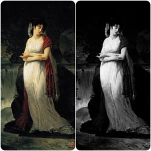
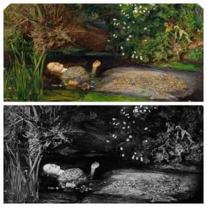
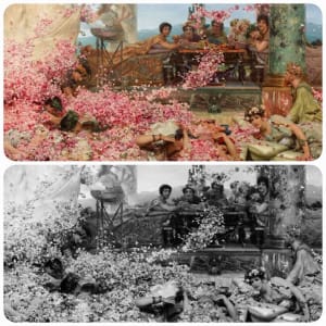
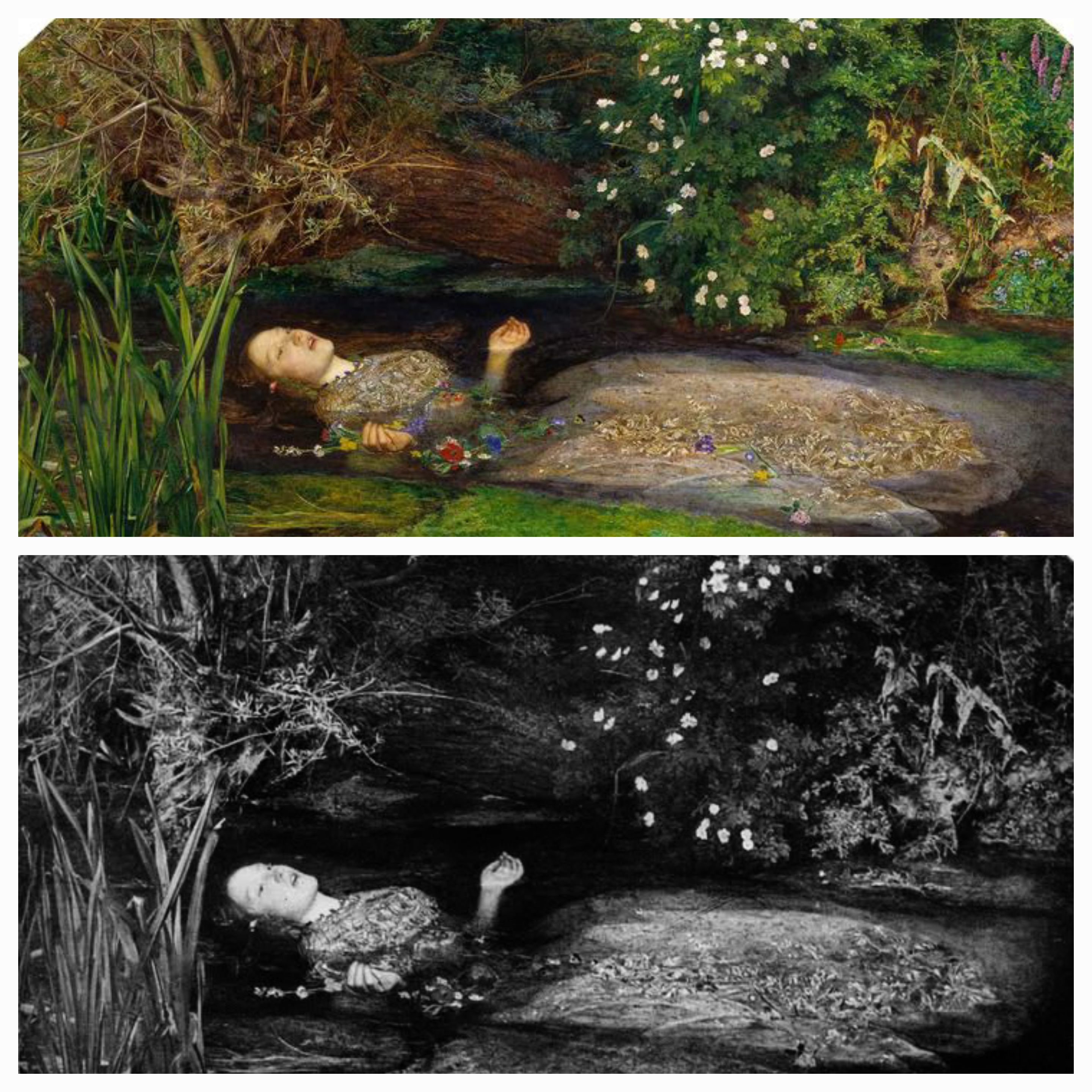
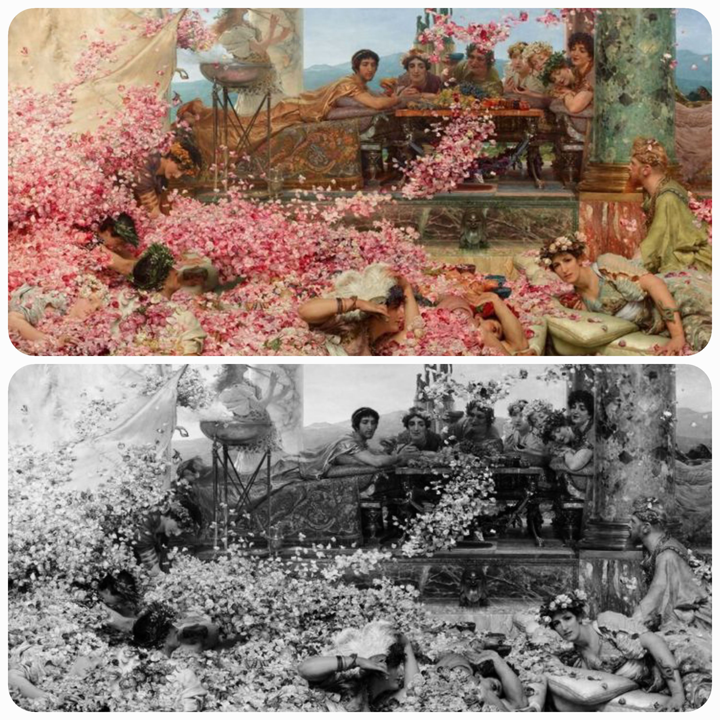
Here’re some my favourist historycal artworks, the values look clearly separated
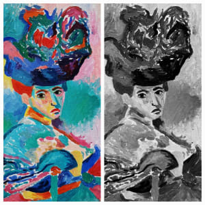
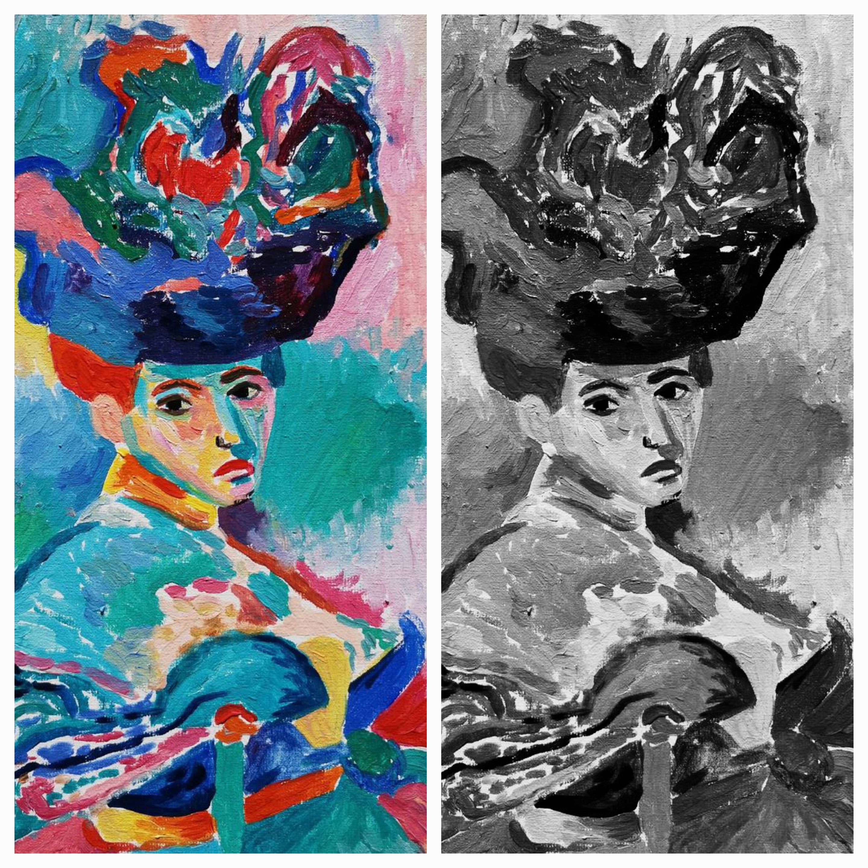
And this’s a painting with unrealistic color of Henri Matisse, still read as a believable scene in grayscale.
-
-

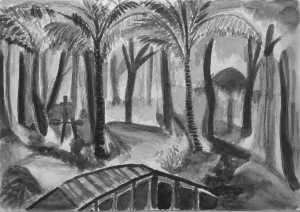
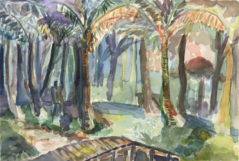
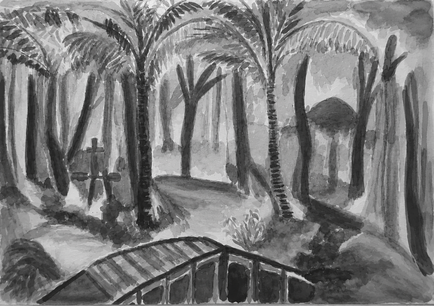
Here is my painting from 2022, I think my painting still reads well in grayscale. The values are good sense of light, form, and space in my opinion.
-
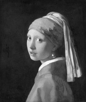
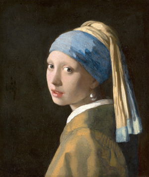
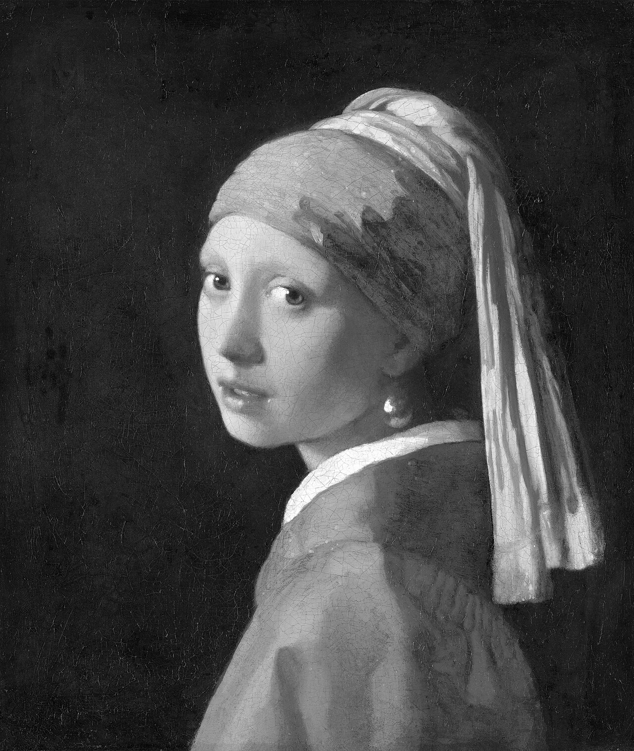
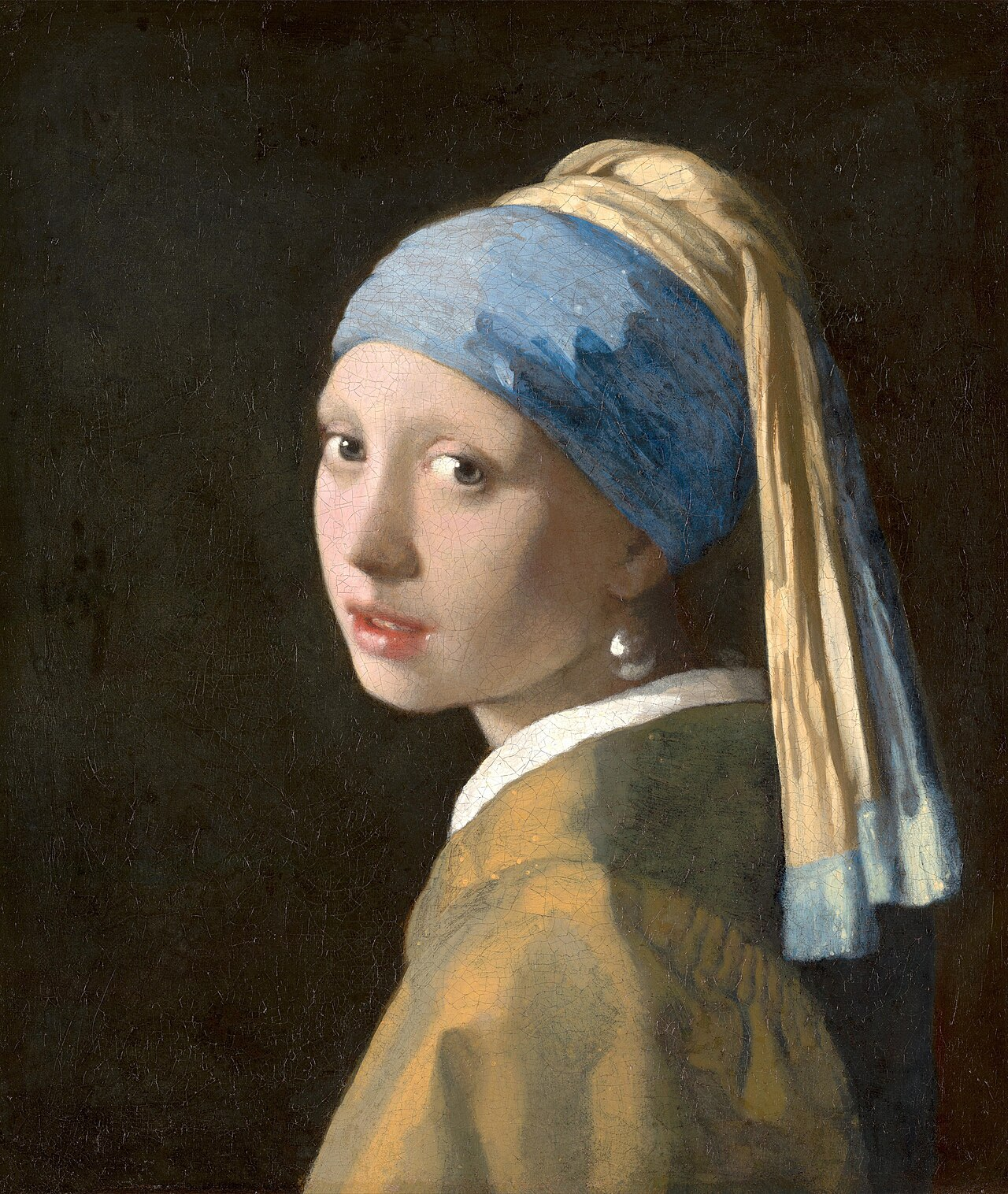
Girl with a Pearl Earring still look believable in grayscale. The dark background and bright face make good contrast, so it have clear depth and focus. I think this painting show that value is more important than color for making form and space.


Leave a Reply
Submit homework on this lesson — log in or create a free account.
Log in Create free account